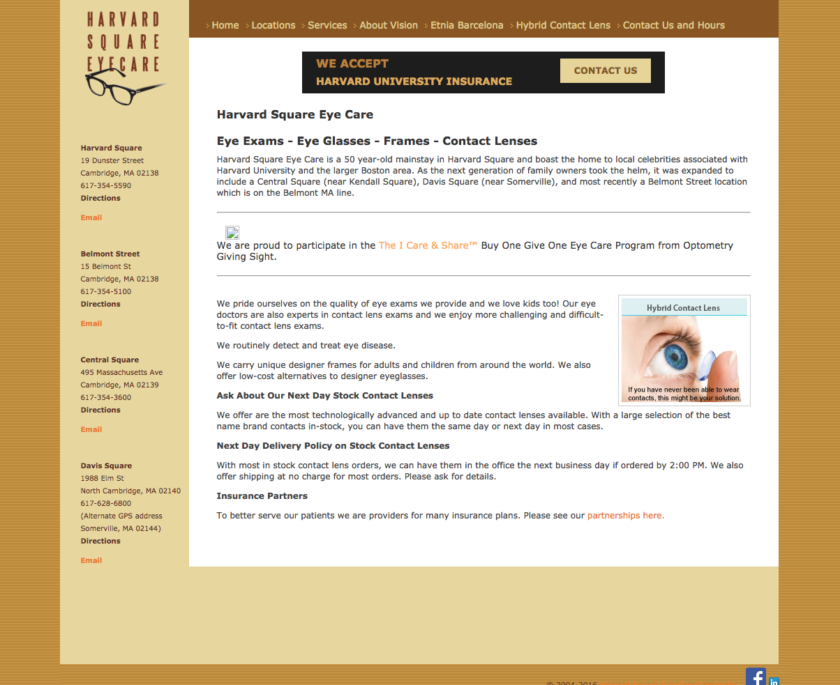
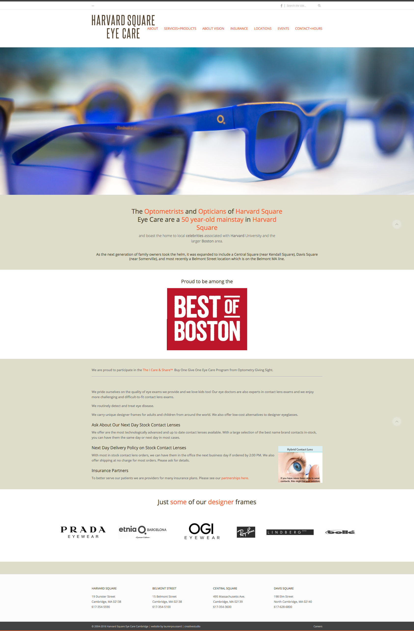
We get a lot of calls from people who are having problems with a website that was customized for them a few years ago or so. This can happen when things are set and left to their own devices. Over time, the plugs and themes start to get outdated and don’t work so well with newer versions of WordPress. Even a seemingly simple site can start to degrade over time. This happened recently to our friends over at Harvard Square. Their site was very clean on the backend, but SOMETHING had happened, and many pages were seemingly deleted, links were lost, old apps weren’t working, the menu just wasn’t working, and the “mobileness” of the site was lost. They have a very savvy Office Manager who tried to restore the site from a previous backup – but the site had only been backed up 6 months ago – and that didn’t really solve the problem. After analysis, I thought the site really could benefit from an overhaul – better to spend the time fixing the problem and moving forward then just fixing the problem and still having an outdated site. And so we did just that. Giving the site a makeover meant all the content was still there – no need to reinvent the wheel and no need to worry too much about page redirects.
Use the arrows to slider over to see a “Before and After” of the home page:


A busy practice with four locations, HSEC needed an easy way for people to contact each location, so we created a table-style contact page with a customized Google Map at the top and on each location tab. We also made all of the telephone numbers “dialable” – not all of the phones automatically dial a number it finds in the browser – now it will. One-click access for their clients!
We still have some little tweaks to make and will be working with our friends over at Guarino Design Group to create more customized artwork to enhance the site, but HSEC is now “out of the woods” in terms of the website issues they were having last week.


