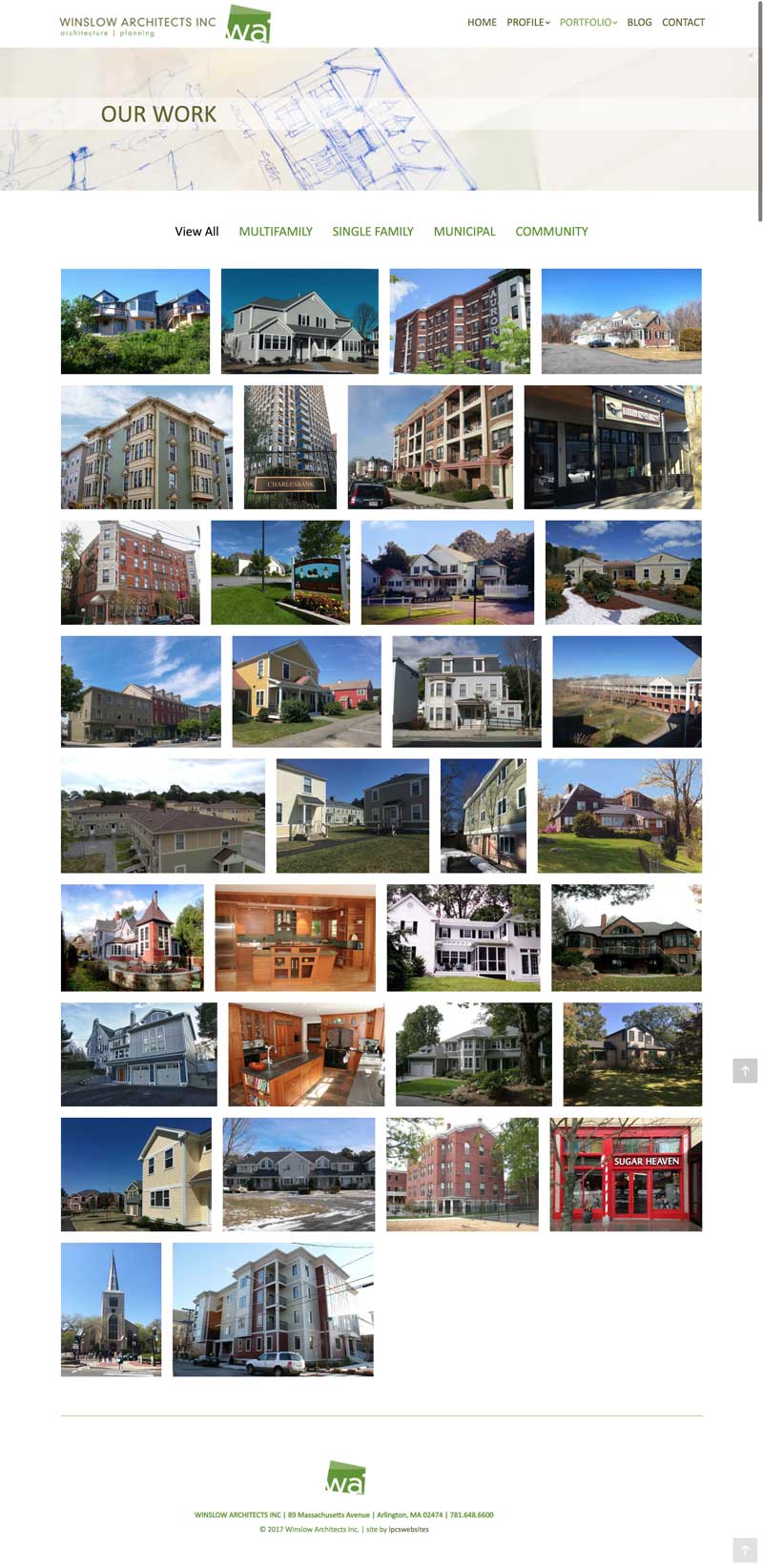
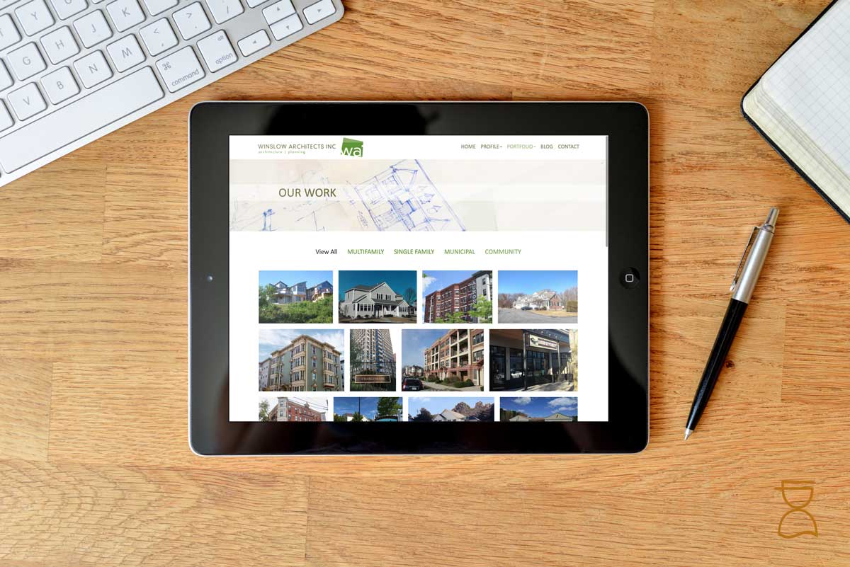
The New Year is always a fun time because there is a huge push to get new websites out in time for the new marketing year! This week we are launching a new site for our friends over at Winslow Architects. This new website replaces an old site with “above the fold” content, flash players and a look that is circa 2010. That old site owes them nothing though – that’s a long time for a website and it was awesome in it’s day. But times change, standards change, and we needed something that was more in keeping with current design standards.
The biggest design challenge on a site like this is the portfolio section. Finding a way to showcase a client’s work beautifully, fast, consistently and user-friendly is no small thing, especially when the portfolio is large – we were starting with over 30 projects! We designed a layout that simulated their printed portfolio booklets, and created individual slideshows for each project. Images on websites can be tricky – they need to be large enough to be seen on a retina screen, but small enough to be served efficiently on a mobile device… this takes alot of time in resizing and optimizing! Like most client images, some of the older project images were taken with pocket cameras or cell phones – so we’re starting off with a bad image. In many cases we opted to keep them because even though the images aren’t great, nothing can replace the experience that project brings to the firm, and that is more important in the end. Also, these images won’t look too bad on mobile devices.
Some features of this new site:
- Customized interactive slideshow headers for landing pages
- 30+ Project Portfolio
- New Team section with headshots and fact or fiction game for each team member – even Winnie the company dog!
As with all of our website implementations, the client will also benefit from
- redirection
- analytics
- security features
- contact form database
which we install on all sites by default.
Looking to starting your year off on the right foot? Give us a call, we’d love to help!


